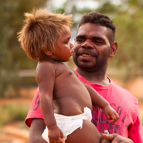
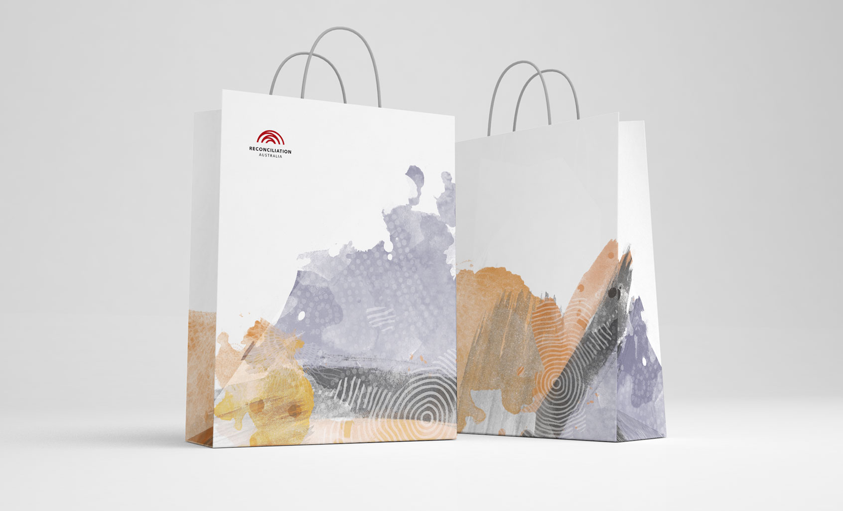
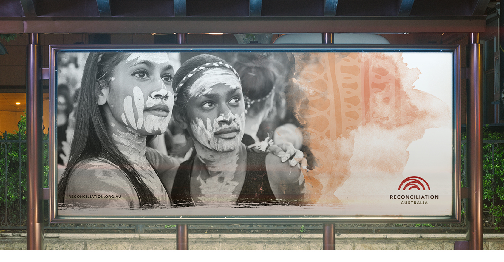
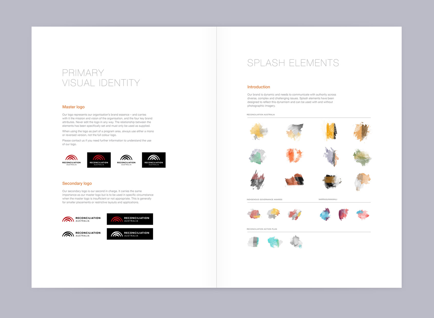
Reconciliation Australia (RA) approached Gilimbaa to evolve their brand into a symbol that could strengthen and lead them into the next chapter of Australia’s reconciliation story. This branding work involved a series of workshops and consultations to gather information on the potential touch points where the brand will be in use, as well as the various areas of RA that will be applying the brand in some form. Delivery of a complete brand refresh included logos, bespoke splash elements and a style guide incorporating branding guidelines and templates for application of the branding in all areas of communication.
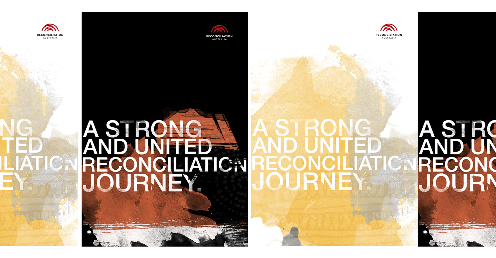
The logo represents the organisation’s brand essence of a strong and united reconciliation journey. The logo was created to convey a clear and strong vision for reconciliation. A single unbroken line radiates outwards and makes up five arches, representing the five dimensions of reconciliation. The logo can be viewed as both a singular line, a pathway to reconciliation, or as five separate dimensions woven together, symbolising that the five dimensions of reconciliation must be woven together in order for reconciliation to be fully realised. It creates a direct line back to its origin, symbolising our connection with our history.
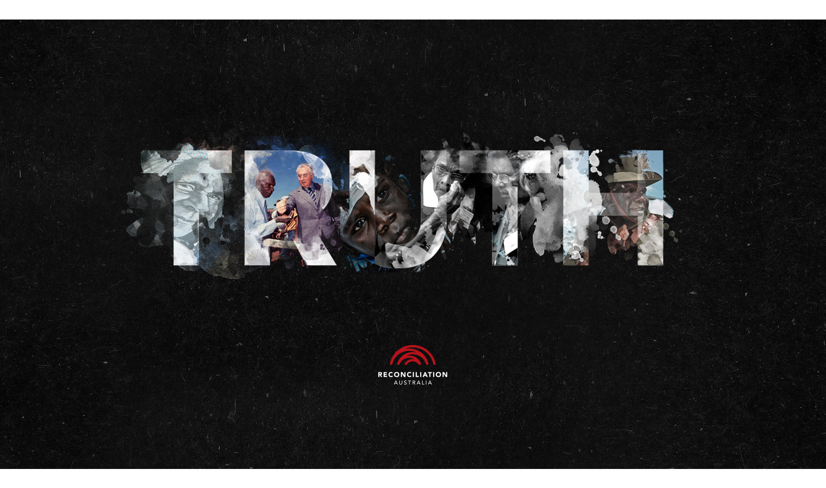
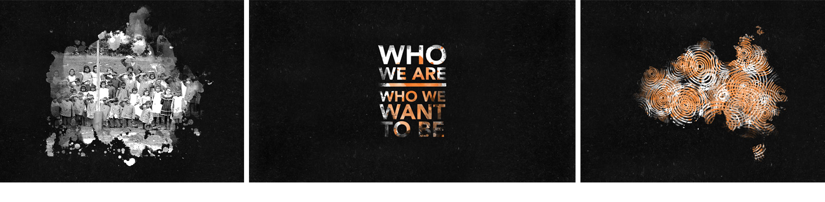
Reconciliation Australia animation is the culmination of 6 months work and collaboration with Gilimbaa and Reconciliation Australia. The team worked together to create story that would inform, mobilise and unite Australia towards Reconciliation and a strong future together. The State of Reconciliation Australia Report which was released with the above animation is the first of its kind since 2000, the Report highlights what has been achieved under the five dimensions of reconciliation: race relations, equality and equity, institutional integrity, unity, and historical acceptance and makes recommendations on how we can progress reconciliation into the next generation.